


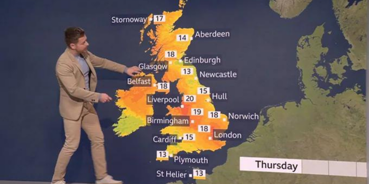
The BBC has been blasted as “utterly farcical” after one of its weather segments showed a map of the UK and Ireland in which temperatures as low as 13C were displayed in orange, and 20C in dark red.
The broadcaster had aired the forecast on Tuesday night – but its data presentation sparked confusion among viewers who accused it of going “a bit far” and even spreading “climate propaganda”.
On social media, one commenter described the BBC’s colour choices as “utterly farcical”, adding: “I’m not a massive conspiracy theorist but I have to agree with those who castigate the utterly ludicrous use of bright yellow and orange/red on the weather maps to indicate temperatures of 18/19C!”
Another said the BBC “need to give their heads a collective wobble”, asking: “Since when has 13C warranted yellow/orange on the weather map?!”
The BBC’s map, in which temperatures as low as 13C were displayed in orange, and 20C in dark red
BBC
Toby Young, founder of the Free Speech Union, said the corporation was “going a bit far” with their weather reporting, and joked: “How is it going to represent temperatures above 20C? Fireballs?”
In contrast, a GB News weather segment today presented a map in which temperatures of 20C+ were shown in yellow, while levels throughout the mid-teens were displayed in green.
Writing in the Telegraph, commentator Ross Clark had accused the BBC of spreading climate alarmism, claiming: “Weather maps with lurid colours are part of an armoury of propaganda weapons designed to convince us that we are at 10 minutes to midnight in tackling climate change.”
Clark said a BBC explanation that the colour scheme was in place to help colour-blind viewers was “a little odd given that the most common form of the condition comes with people being unable properly to see reds and greens.”
MORE ON THE BBC:
The BBC “need to give their heads a collective wobble”, according to one social media user
PA
This isn’t the first time the BBC has been criticised for its weather presentation; last year, the broadcaster had been forced to defend its colour scheme after viewers claimed it had made a map’s colours more intense in order to raise alarm over increasing temperatures.
At the time, images comparing weather maps from 2003 and 2016 went viral, with social media users again making accusations of alarmism.
The BBC has said: “The colours used now range from blue for the coldest temperatures through to red for the hottest temperatures as these colours are easier to see if you live with colour blindness.”
Conversely, the broadcaster’s weather service has been panned for being “gloomy” in its forecasting by showing the worst possible conditions – even if they are not predicted to last long.
In response, a spokesman for the corporation had told the Times: “The day symbol reflects the weather conditions likely to have the greatest impact on people’s lives.”
GB News has approached the BBC for comment.


